A computer screen displaying a spreadsheet of financial data.

dv01

How can we eliminate our clients' confusion when analyzing loan datasets on our platform?

This was a short term design exercise for a fintech company that specializes in helping clients with end-to-end loan data management, reporting, and analytics for structured products and private credit.

For the exercise, I revamped the navigation structure and modernized the interface

TIMEFRAME

~5 hours for research and design

Tools

Figma, FigJam, ChatGPT

My task is to...

Redesign the Context Header section to create a modernized interface that enhances clarity and user experience, so that clients can seamlessly find and analyze complex datasets to make confident business decisions.
The words Who Why What leading to How with an arrow

Who

👩‍💻 30-50 year old clients interested in loan investing
đź’µ Works in finance
➡️ Likely experienced in using analytics, charting, and modeling tools for decision-making, like Bloomberg Terminal

A man in a suit and tie is standing in front of a woman who is looking at a computer screen

Why

Reduce time spent on helping customers with navigation issues on platform Increase trust in our product and company

A person is writing on a notebook in front of a laptop

What

dv01 provides clients with a platform to analyze securities so that they can make smart investment choices However, users have trouble understanding product offerings in relation to the datasets they want to analyze

Screenshot of dark mode screen with financial data table with annotations in yellow

Defining the problem

Our customer needs to easily analyze datasets to complete their job.  Our solution should deliver a way for them to add, find, and filter datasets so that they can complete their jobs without feeling frustrated or confused.

Design Mandates

01
Enhance clarity and usability
How can we ensure customers are finding specific datasets as needed?
02
Modernize UI
How can we provide customers with a pleasant interface they enjoy using?
03
Prioritize  search-driven experience
How can we ensure customers can seamlessly user our platform in an intuitive way?

Insights from observations

Colorful cards containing categories of information of how insights were found, such as "pain points"

Evaluating the current platform to find out how to meet user goals

Evaluation

Gestalt Principles

The current platform could benefit from applying the principle of common region to multiple areas of the Context Header. There are multiple areas where related items are far from each other, making it difficult to tell what parts of the navigation are related.

Screenshot of dark mode screen with financial data table with annotations in yellow

Heuristic Evaluation Violations

Consistency and standards
The current breadcrumb structure is inconsistent between pages, and the current placement doesn’t follow conventional standards.
Recommendation: Exclude tab names and move breadcrumbs to top of the page
Recognition rather than recall
User feedback tells us customers aren’t able to remember how to navigate to relevant datasets and unfamiliar icons are used for the side navigation
Recommendation: Use tooltips to help identify items, and build out robust search functionality
Aesthetic and minimalist design
User feedback tells us customers don’t really use context header for navigation and there are several button styles that could be simplified
Recommendation: De-emphasize tabs

Understanding user goals and actions

A big challenge for me while working on this was fully understanding the user’s task and platform shortcomings. After mapping out the current flow, I still had lingering questions (in orange), but did my best to come up with some happy flows

3 frames with colorful sticky notes inside

Sketches and exploration

9 webpage layout sketches laid out in a grid

Sketches

Exploring advanced search

Inspiration from Zendesk and Google Drive

A screenshot of a data set page with a list of data sets.
Sketch of a webpage with a list of data sets.

Sketches

Exploring layouts

Inspiration from Jira and Asana

A screenshot of a computer screen with a search bar and a dropdown menu.
Sketch of a webpage with a list of data sets.
A screenshot of a project management software with a purple button that says "add new client".
Sketch of a webpage with a list of data sets.

Low-Fidelity Wireframes for Concept #1

Loan tape view

A screenshot of a computer screen with a table of data.
Option 1
This solution relies heavily on layout to clarify visual hierarchy for different pieces of information
A screenshot of a data set page with a list of data sets.
Option 2
Not sure how this would work with multiple datasets selected, but would like to explore this idea more

Low-Fidelity Wireframes for Concept #2

Power search

A screenshot of a data set page with a list of data sets.
Eliminates dependency on product knowledge, but allows use for them if wanted
A list of options for a search bar.
Users can quickly skim results for data set they want and select from pre-determined filters
A screenshot of a computer screen with a list of security labels.
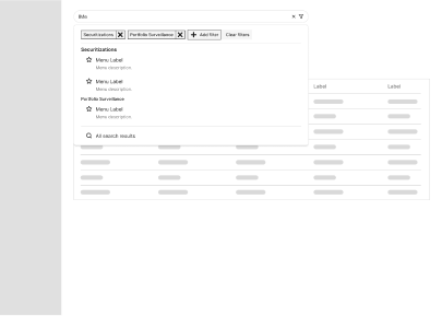
Users can manually add and delete filters for data sets

Design Inspiration

Robinhood

A computer screen with a chart of stocks.

Coinbase

A computer screen with a chart of stocks.

Final design

Screenshot of a dashboard with a table showing financial data

Final design

Hidden summary

Screenshot of a dashboard with a table showing financial data

Final design

Expanded navigation

A computer screen with a chart of stocks.

Next Steps

  • Clarify and discuss ideas with stakeholders
    Prioritize features with PM & engineers
  • Define success metrics to determine success
  • Evaluate designs with user testing